

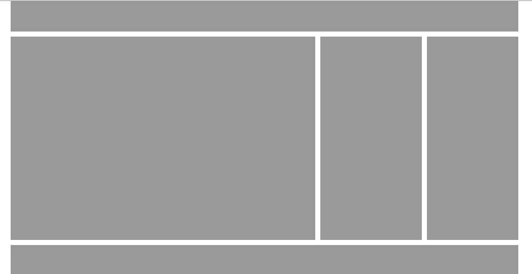
上-(左中右)-下 固定宽度且居中布局
通过上一节的《上-(左右)-下 固定宽度且居中布局》基础,站长地带进一步加深,实现上-(左中右)-下 固定宽度且居中布局。
效果如下:
代码如下:
<!DOCTYPE html PUBLIC "-//W3C//DTD XHTML 1.0 Transitional//EN" "http://www.w3.org/TR/xhtml1/DTD/xhtml1-transitional.dtd">
<html xmlns="http://www.w3.org/1999/xhtml">
<head>
<meta http-equiv="Content-Type" content="text/html; charset=gb2312" />
<title>上-(左中右)-下 固定宽度且居中布局 站长地带www.zzarea.com</title>
<style type="text/css">
*{
margin:0px;
padding:0px;
}
.head{
width:1000px;
margin:0 auto;
margin-bottom:10px;
height:60px;
background-color:#999;
}
.center{
width:1000px;
margin:0 auto;
margin-bottom:10px;
height:400px;
}
.left{
width:600px;
background-color:#999;
height:400px;
float:left;
margin-right:10px;
}
.mid{
width:200px;
background-color:#999;
height:400px;
float:left;
margin-right:10px;
}
.right{
width:180px;
background-color:#999;
height:400px;
float:left;
}
.foot{
width:1000px;
margin:0 auto;
height:60px;
background-color:#999;
}
</style>
</head>
<body>
<div class="head"></div>
<div class="center">
<div class="left"></div>
<div class="mid"></div>
<div class="right"></div>
</div>
<div class="foot"></div>
</body>
</html>
备注,本节的效果不错,学员都掌握了,部分已经有了写法思路,会灵活执行,部分用了清除浮动实现效果,非常好
声明
源码下载不顺利,比如源码在百度网盘的有时会被无故取消等,请联系QQ:46667551
本站大部分下载资源收集于网络,但除特别说明之外,基本全部亲自测试可用!
但由于某些源码的更新迭代,比如微信小程序官方接口的变动等原因,
如时间过长,可能会造成本可以使用的代码出现问题,下载前请斟酌!
本站资源仅供学习和交流使用,版权归原作者所有,请在下载后24小时之内自觉删除。
若作商业用途,请购买正版,由于未及时购买和付费发生的侵权行为,使用者自行承担,概与本站无关。
原文链接:https://www.love0312.com/974.html,转载请注明出处