

CSS实现栅格布局的两种方法
作者:admin 时间:2020-01-14 阅读数:270人
CSS实现栅格布局的两种方法
一、使用float:
代码如下:
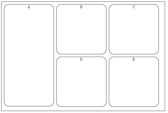
<!DOCTYPE html> <html> <head> <meta http-equiv="Content-Type" content="text/html; charset=utf-8" /> <title></title> <style> section { border: solid 1px; } section section { float: left; margin-left: 10px; margin-top: 10px; text-align: center; width: 200px; border-radius: 20px; height: 200px; } .parent { height: 440px; width: 660px; } .parent section:first-child { height: 410px; } </style> </head> <body> <section class="parent"> <section>A</section> <section>B</section> <section>C</section> <section>D</section> <section>E</section> </section> </body> </html>二、使用display:flex(这个css3属性仅谷歌和火狐支持)
代码如下:
<!DOCTYPE html> <html> <head> <meta http-equiv="Content-Type" content="text/html; charset=utf-8" /> <title>www.zzarea.com</title> <style> section { border: solid 1px; } section section { margin-left: 10px; margin-top: 10px; text-align: center; width: 200px; border-radius: 20px; height: 200px; } .parent { display: flex; flex-direction: column; flex-wrap: wrap; height: 440px; width: 660px; } .parent section:first-child { height: 410px; } </style> </head> <body> <section class="parent"> <section>A</section> <section>B</section> <section>C</section> <section>D</section> <section>E</section> </section> </body> </html>实现效果如图所示:
当然使用table和负边距也是可以实现的,有时间补上:-D
以上就是本文所述的全部内容了,希望大家能够喜欢。
声明
源码下载不顺利,比如源码在百度网盘的有时会被无故取消等,请联系QQ:46667551
本站大部分下载资源收集于网络,但除特别说明之外,基本全部亲自测试可用!
但由于某些源码的更新迭代,比如微信小程序官方接口的变动等原因,
如时间过长,可能会造成本可以使用的代码出现问题,下载前请斟酌!
本站资源仅供学习和交流使用,版权归原作者所有,请在下载后24小时之内自觉删除。
若作商业用途,请购买正版,由于未及时购买和付费发生的侵权行为,使用者自行承担,概与本站无关。
原文链接:https://www.love0312.com/1053.html,转载请注明出处
上一篇:CSS换行详细教程